Poster Guidlines
Instructions for Poster Presenters:
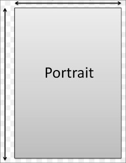
Poster presentations allow the audience to get a clear visual of the presenters' work in a simple format. The reasonable size for posters is 2.5 feet width (76.2 Centimeter), 3.5 feet height (106.68 Centimeter).
Poster Presentation Recommendations:
The poster should clearly present the title, the author(s), affiliation(s), and a description of the research, along with highlighting the abstract's major elements.Remember that pictures, tables, and figures are key to any poster display. At least 50% of the surface area should be used for photos, graphs, or diagrams. Good use of color and the use of black or dark blue for text. Too much color can be hard to read! One or two large, high-quality photographs attract attention. Make the title large and clear! Include author(s) name(s) and address(es). Your poster title should be easily readable from 3 - 4 meters away. We recommend the following sections on the poster: Abstract, Introduction, Methods, Tables, Figures, Results, and Conclusions.
- For those who are presenting virtually, we ask that you create a powerpoint instead of a poster to feature your research
- The powerpoint may be up to 10 slides (ideally 7-10 slides in length)
- You may have up to 7 minutes to present
Further guidlines to follow:
- Poster presentations give the audience a clear visual of the presenter's work in a simple format. The reasonable size for posters is 2.5 feet wide by 3.5 feet high.
- Present the title, the author(s), affiliation(s), and a description of the research, along with highlighting the abstract's major elements.
- Minimize detail and try to use simple statements. Keep it short and easy to read.
- Remember that pictures, tables, and figures are key to any poster display.
If possible, use color in your visuals.
- Don't overwhelm the audience with excessive information. Instead, construct a display that enhances the presentation.
- At least 50% of the surface area should be used for photos, graphs and diagrams.
Use a clear structure and layout.
- Use complementary colors. Use black or dark blue for text. Too much color can be hard to read!
- One or two large, high quality photographs attract attention.
- Your title should be a condensed statement of the main idea of your poster. It should be large and clear.
- Your poster title should be easily readable from a distance of 3-4 meters. Include author(s) name(s), and address(es).
- We recommend the following sections on the poster: Abstract, Introduction, Methods, Tables, Figures, Results, and Conclusions.
- Please put up your own poster in the position indicated by your presentation number by noon of each day.
- Presentation numbers are already indicated on display panels. Please check your presentation number and be careful to put up your poster on the correct panel. Please use pins to put up posters. Please do not use glue or sellotape.
- Please present your work in front of your own poster during the poster session.
- The best poster presentation award will be chosen by votes of all participants.
- Posters will be changed every day. Please help by taking your own poster down. Posters still displayed after the removal time has passed will be disposed of by the secretary the following day.
- Portrait size: 2.5 feet width (76.2 centimeters), 3.5 feet height (106.68 centimeters)

|